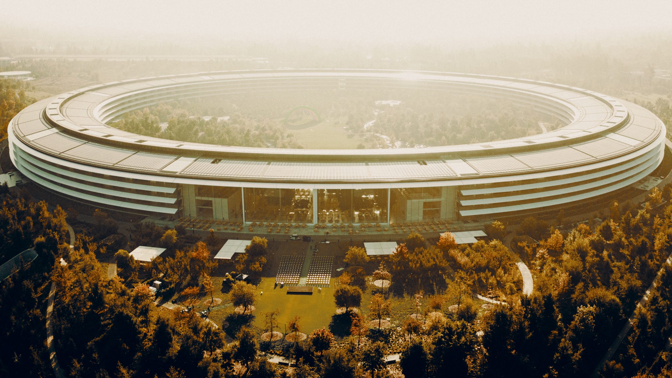
Apple has become one of the largest companies in the world, with a market value of more than $2 billion. They also employ more than 150,000 people. Known globally for changing the world of technology, they also place considerable importance on design and brand identity. So, it’s no surprise Apple Park has attracted attention.
A-Bit About The Building
Apple’s home in Cupertino, California, and its main headquarters have been at 1 Infinite Loop since 1993. In 2017, the company finished constructing its new “The Ring” building at One Apple Park Way. Foster + Partners designed the campus to create an ideal workplace centred around creativity, innovation, and wellbeing.
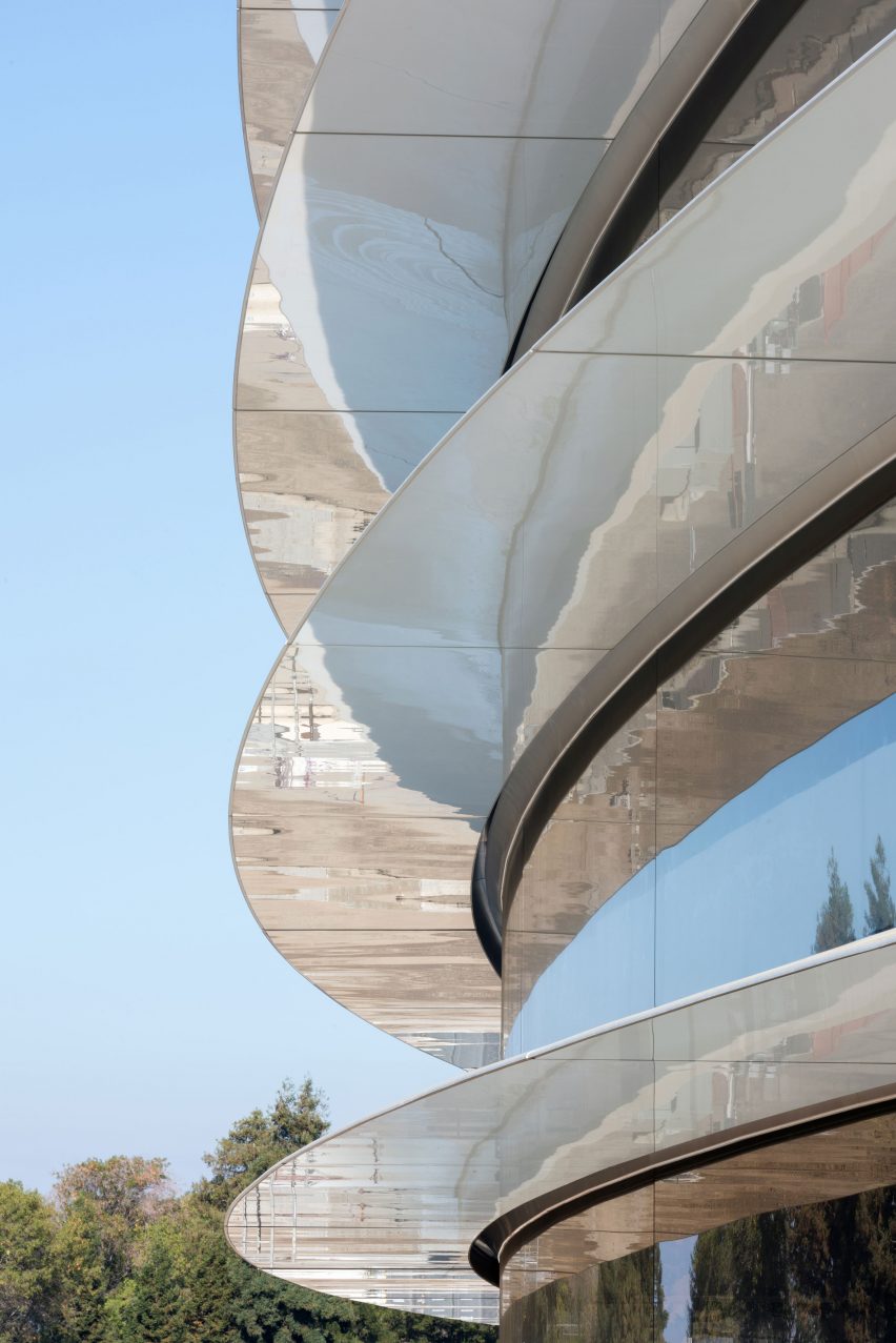
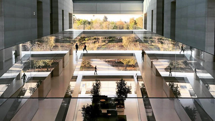
Although many refer to it as the flying saucer, Apple calls the main campus building The Ring. The building features eight hundred 45 ft tall, rounded glass panels that connect around the four-storey structure. The Ring is divided into eight identical segments and surrounded by a hallway roughly three-quarters of a mile. At the eight cardinal axis points, full-height atria create light-filled “entrance commons” and social spaces that connect the park to the garden space within the Ring.
The Designers
Former Chief Design Office, Jony Ive, worked with Foster + Partners to design Apple Park. His vision for the office was to create a workspace that would promote collaboration, enabling Apple to create better products.
“Our building is very configurable. You can very quickly create large open spaces, or you can configure lots of smaller private offices. The building will change, and it will evolve.”
The Interior & Space Planning
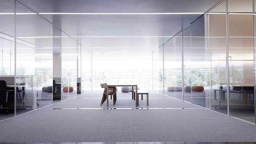
The vast space comprises a few core elements: communal “pod” spaces for collaboration, private offices for individual, focused tasks, and broad glazed perimeter walkways. The concept for the restaurant was to create a campus town square. It occupies the entire northeast axis and consists of a quadruple-height dining hall and terraces, encouraging interaction and socialising. Vast glass doors (the biggest of their kind ever constructed) slide open effortlessly, connecting the dining area with the surrounding landscape. The cafe can serve up to 14,000 meals daily and seats up to 4,000 people.
Furniture
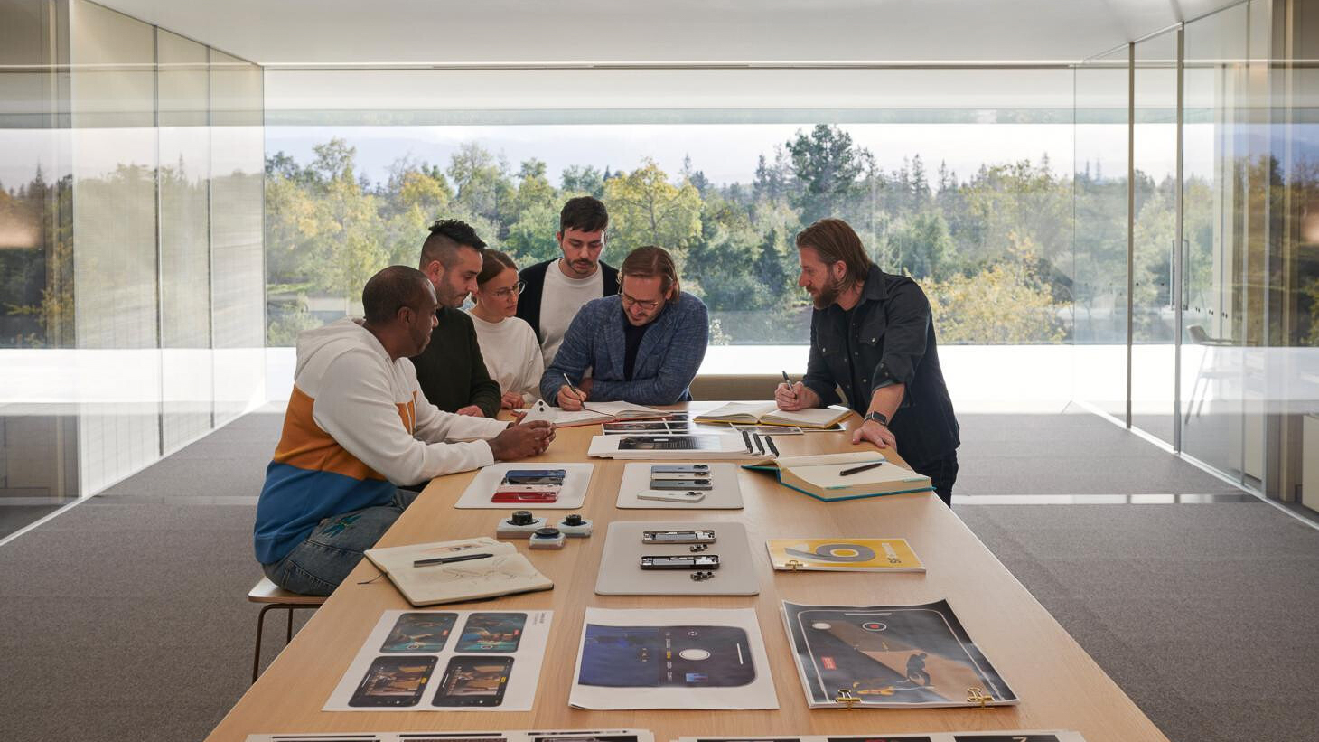
Even the furniture Apple selected was chosen to encourage and enable collaboration. They decided to use wide 9 ft long tables, constructed from continuous sheets of solid white oak sourced from Germany, designed by Dutch company Arco. There are no visible seams due to the company’s innovative manufacturing technique. Dotted around the dining area, you will find The Hiroshima Chair, a simple and stylish armchair designed by Naoto Fukasawa. Starting at $2,500, there are more affordable options than this chair. But, it is no surprise that a company like Apple, which invests so much time and money into its products, would pay the same attention to the furnishing of its headquarters.
Sustainability
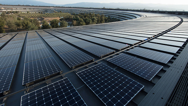
Steve Jobs’ dream for the campus was to reflect Apple’s values, not just regarding technology but also the environment. Its sustainability credentials are impressive. It is the world’s largest naturally ventilated building. It also features one of the largest solar installations in the world – nearly every inch of the roof can generate electricity. The facility requires no heating or cooling for nine months of the year, and it contains about 4,300 hollow concrete slabs, which helps keep the building cool. Planting 9,000 drought-resistant trees, and with help from a leading arborist at Stanford University, the landscaping will restore some indigenous plant life. Bikes are available on-site for employees to get around the park, and parking spaces are significantly less than the 12,000 employees to encourage car sharing.
Some have questioned how sustainable a campus like this can be. Choosing the suburb in Cupertino means most of its employees must drive to work. In comparison, Google has plans to develop a campus in downtown San Jose, near a train station and with an abundance of living spaces within walking distance. Despite this, a building of this size powered by 100% renewable energy is a huge accomplishment, and we love seeing sustainable buildings constructed.
Criticism
Apple’s headquarters hasn’t come without criticism. In 2018 Dezeen reported incidents of employees walking into some of the vast glass walls. It also noted that some employees who previously had private offices revolted against the new open-plan working space.
Apple’s vision for this office space was to unite its employees across all departments. Unfortunately, not long after completion, the world faced the COVID-19 pandemic. Nearly all employees left the office to work from home. Reports suggest that Apple ordered its employees back to the office as of September this year, insisting that they must work in the office at least three days a week. A petition circulated from a group of employees arguing that the hybrid working model in place over the past few years has led to exceptional work. So even one of the most ambitious office designs in recent years has yet to be enough to lure everyone back to the office. After receiving criticism of the park, Jony Ivy hit back, claiming that the park was designed and built for Apple and not for anyone else.
“We didn’t make Apple Park for other people. So a lot of the criticisms are utterly bizarre, because it wasn’t made for you! And I know how we work and you don’t!”
“I think Apple Park has a very specific role. It’s not a watch. It’s our house, where we go to work together…”
He makes an interesting point, but according to reports, some criticisms have come directly from employees. We always advise anyone undertaking an office fit-out to speak to, and most importantly, listen to, their employees and the everyday users of the building. As with any design project, some things may need tweaking or changing after completion, so constructive criticism and feedback can be productive.
Our Thoughts
One blog post isn’t enough for a design project of this magnitude! We love seeing ambitious architecture that truly has sustainability at its heart. The design of the building, while not everyone’s cup of tea, undeniably encapsulates Apple as a brand, combining technology and innovation with invention. The simple yet beautiful interiors are what we would expect to see. Apple spared no expense with this $5 billion project. It will be interesting to see how the building evolves and how employees use it as the workplace adapts and changes.

